

PRODUCT MANAGEMENT, UX Design
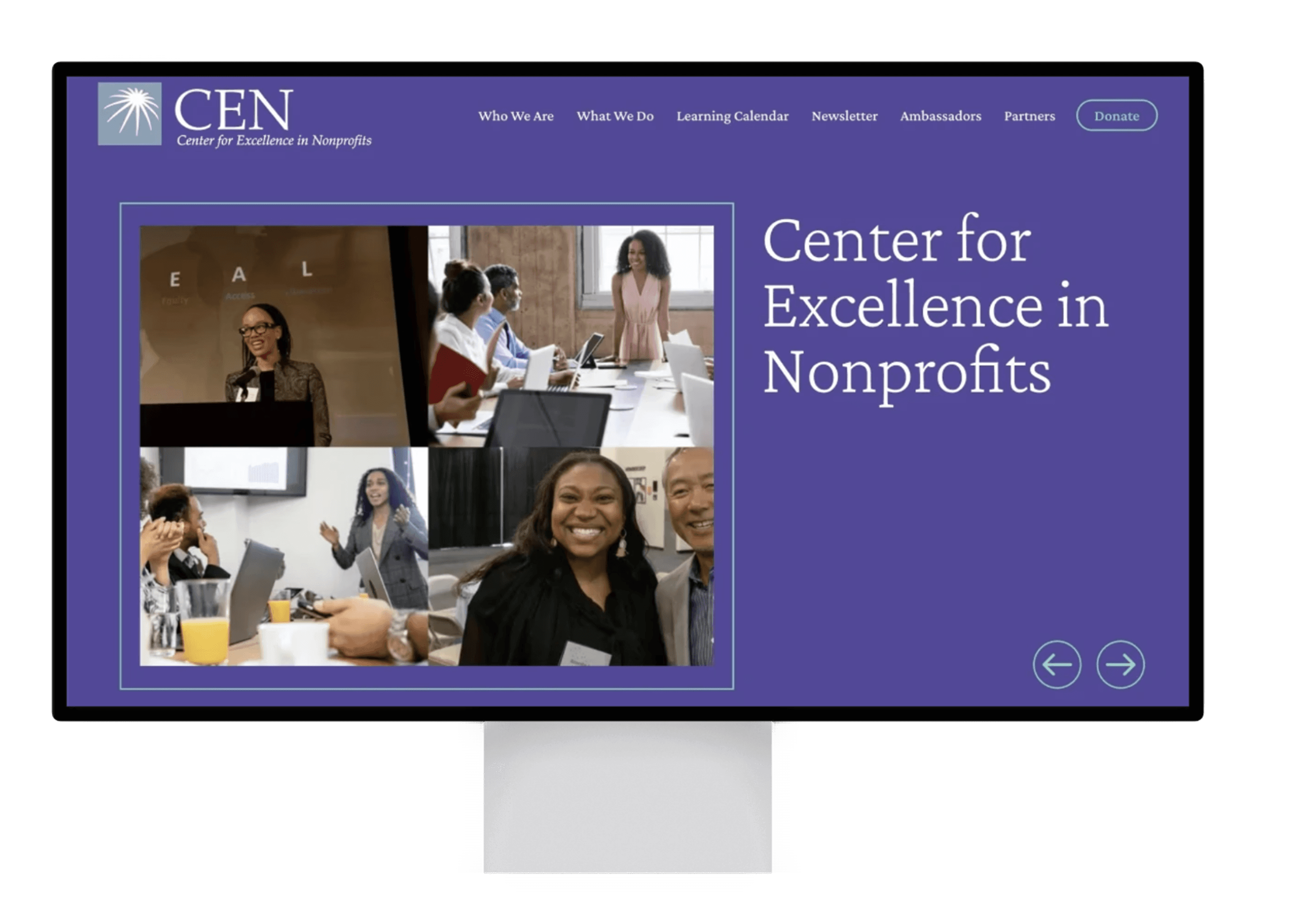
Center for Excellence in Nonprofits Redesign
Company
Develop for Good
ROLE
Product Manager
UX Designer
Team Members
Cindy Chang, Kaitlyn Zhang, Jenifer John, Samiksha Bhargava, Qashka, Shruti Gurav, Sindhu
YEAR
2024-2025
This project aims to enhance user engagement and retention on the website by analyzing user interactions to identify areas for improvement and redesigning the site for better accessibility.
Responsibilities
Managed team progress by maintaining milestones, applying Scrum Agile methodology, UX Research, User testing, and overseeing the design process to ensure alignment with project goals and client vision.
Background
In the Fall of 2024, I had the opportunity to work with Develop for Good and was connected with the non-profit, The Center for Excellence in Nonprofits. Our team collaborated to make their website more accessible and analyzed their user interactions to streamline their pages, ensuring the website is easy to navigate.
About Our Client
The Center for Excellence in Nonprofits (CEN) is a nonprofit empowering leaders and organizations to create lasting impact. Led by its IDEAL principles of Inclusion, Diversity, Equity, Access, and Liberation, CEN's mission is to provide programs and support that strengthen and sustain nonprofit leaders and organizations so they can have lasting impact.
Problem
1) Accessibility and usability challenges
The current CEN website is not fully aligned with WCAG accessibility standards, making it difficult for users with diverse abilities to navigate and engage with the organization’s resources. This gap limits inclusivity and contradicts CEN’s IDEAL principles reducing the organization’s ability to fully reflect its mission.
2) Overly complex navigation
The existing website features too many tabs and a cluttered menu structure, overwhelming visitors and making it harder to find essential information quickly. By not offering a streamlined and user-friendly design, CEN risks reducing user engagement and overall satisfaction.
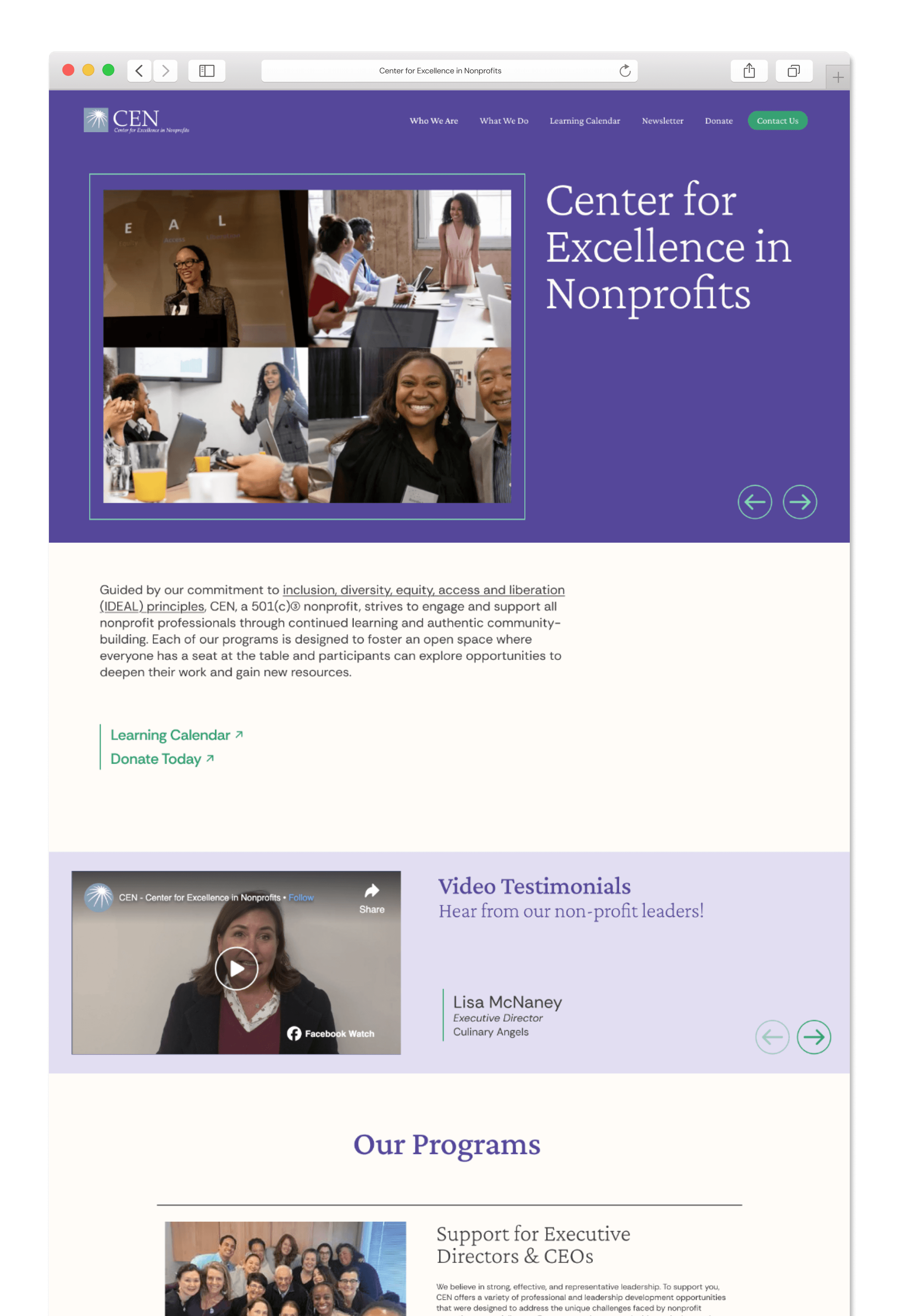
The new redesigned CEN page allows for a more seamless and intuitive experience, allowing users to easily navigate the page.
Navigation Enhancement
Improve the visibility of expandable menu items and make key sections more accessible
Content Organization
Simplify the layout of the landing page and reduce text-heavy sections on the “What We Do” page to improve clarity and readability
Donation and Learning Calendar Visibility
Clearly label involvement opportunities and make them more easily accessible from the homepage
Connecting with the Client
Our team worked closely with the Center for Excellence in Nonprofits (CEN) to gain a deep understanding of their needs and the impact they strive to create. Through discussions with our client, we identified key priorities: an engaging and well-organized website that makes essential resources easy to find and understand. CEN serves nonprofit leaders by providing guidance, training, and support, so it was crucial that the redesigned website offered a seamless user experience that clearly communicated their offerings. By prioritizing accessibility, intuitive navigation, and a visually compelling design, we aimed to create a digital platform that not only enhances engagement but also empowers nonprofit leaders to efficiently access the tools they need to succeed.
Website Analysis
We investigated the information architecture of the CEN website to understand the steps users take when discovering information. The goal was to understand whether users could successfully reach their intended destinations when completing tasks.
Key Issues:
Navigation flow: Several pages overlapped in content or felt redundant
Discoverability: Important actions (e.g. donations, becoming an ambassador) were not clearly grouped
Hierarchy: Some tabs created unnecessary complexity, requiring users to click back and forth
Solutions:
"Who We Are" & "What We Do" Pages
Issue: Users had to click between separate pages for related information (e.g. Board of Directors & Team)
Change:
Consolidated into “Who We Are” (includes Board of Directors & Team)
Refined “What We Do” to highlight CEN’s main focus areas while linking key programs (Learning Calendar, Boot Camps) for easy access.
"Partners" Page
Issue: Redundant as a standalone tab.
Change: Moved under “Who We Are” tab for easier exploration.
"Donate" & "Ambassadors" Pages
Issue: Having Donate and Ambassadors on separate pages made it unclear that these were both ways how users could “Take Action”
Change: Consolidated into a unified “Take Action” page, where users can both donate and learn about becoming an ambassador.
"Newsletter" & "Learning Calendar" Pages
The client wanted these two sections emphasized, so we kept “Newsletter” and “Learning Calendar” as individual top-level tabs for quick access.
Competitive Analysis
We looked at other non-profit pages to see what worked and what didn't
The Prevention Network's donate button featured a strong call to action color. When clicked, the information hierarchy was clear, making it easy for users to understand and donate.
The Malala Fund has an eye catching banner that showcases Malala’s work in a clean and engaging way, but lacks information above the fold.
The Phillips University Legacy Foundation homepage is well-organized and clearly defines its mission. It also includes quick-access buttons to the programs they offer, encouraging users to explore the site further.
Youth Challenge International features testimonials from individuals who have participated in the program, which enhances the organization’s credibility.

How might we redesign the CEN website to create an intuitive, memorable experience that encourages users to return and reflects CEN’s core values?
Ideation
Sitemaps
Original Sitemap

Redesigned Sitemap

Wireframes
Learning Calendar
See what educational opportunities that CEN has to offer, including their upcoming events and special programs.
Because the Learning Calendar is one of the more visited pages on the CEN website, it was important for the page to provide the most value to its visitors.
Before

After

Donations
See how your donations help CEN empower new nonprofits and expand their impact. Every gift supports growth, learning, and community change.
The UX writing of this page was a major topic of discussion, specifically regarding the naming of the page. “Take Action” effectively communicated the purpose and value of the page.
Before

After


Lo-fi
Hi-fi
Final Designs
Homepage
Learning Calendar

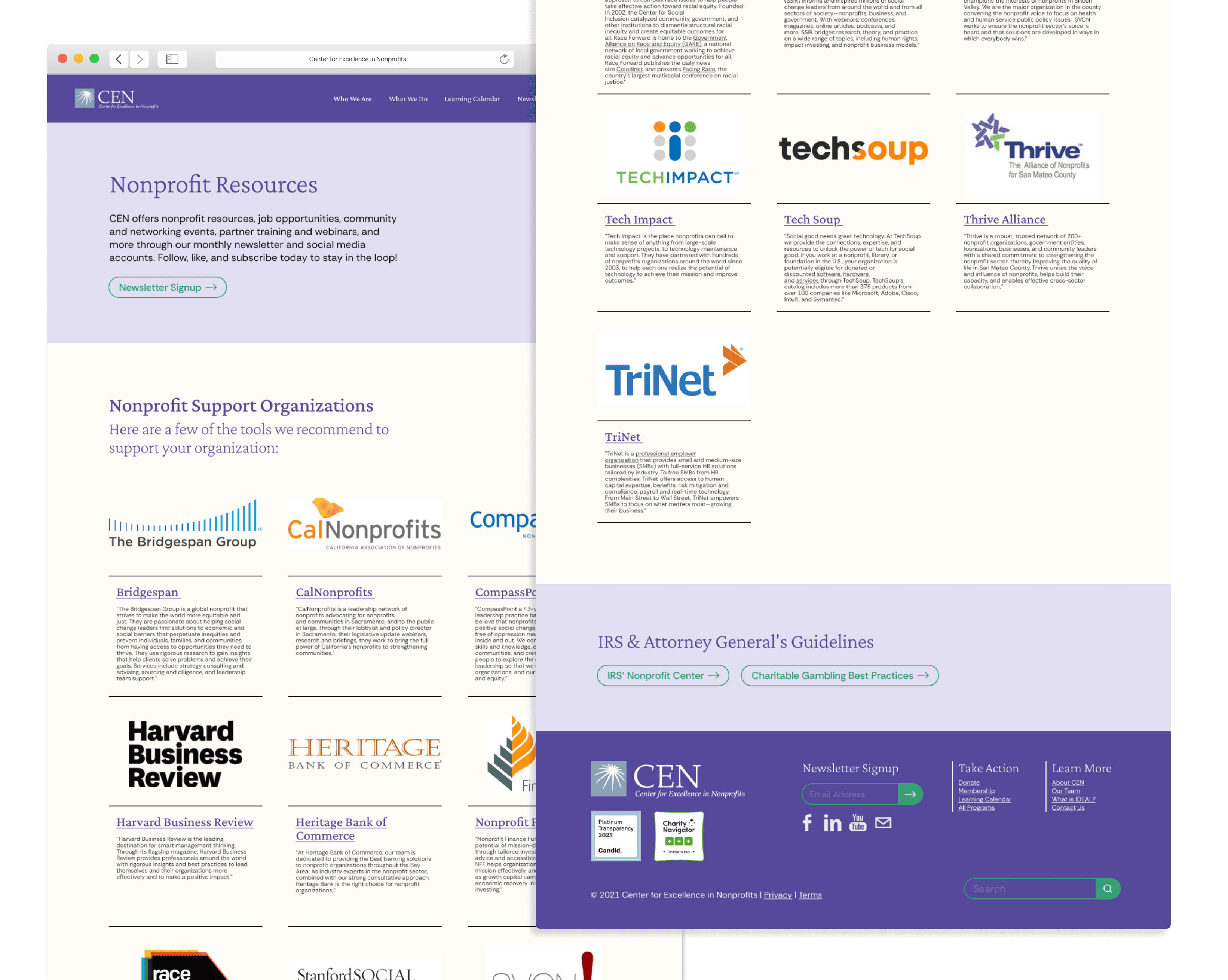
Nonprofit Resources
User Testing
We partnered with three CEN members to conduct tree testing, evaluating the website’s navigation and the findability of key pages frequently visited by users. The goal was to assess user experience, identify usability pain points, and gather actionable suggestions for improvement. The testing provided valuable insights into users’ navigation patterns and challenges.
Key Findings:
Users struggled with the “What We Do” page and found the Learning Calendar difficult to navigate
Registering for the Bootcamp was challenging, as users had trouble locating the relevant information and ended up searching through the Learning Calendar
Locating the CEN values was difficult, as users expected to find this information under the “Who We Are” section but couldn’t easily access it
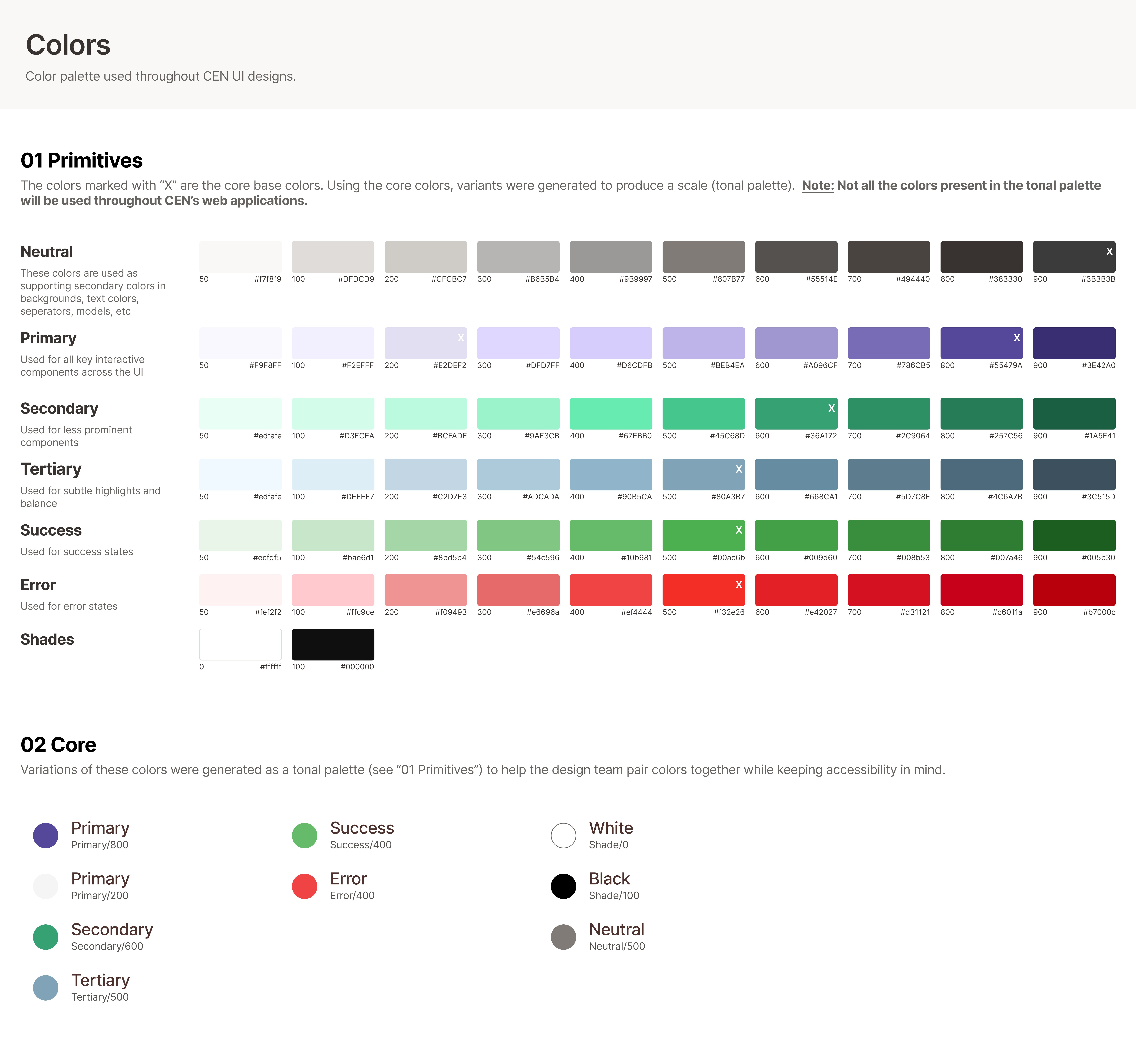
Design System
In collaboration with the client, we agreed to use the style guide outlined below. This palette helps establish consistent design patterns across all our pages, with special attention given to contrast and accessibility to ensure usability across all interfaces.

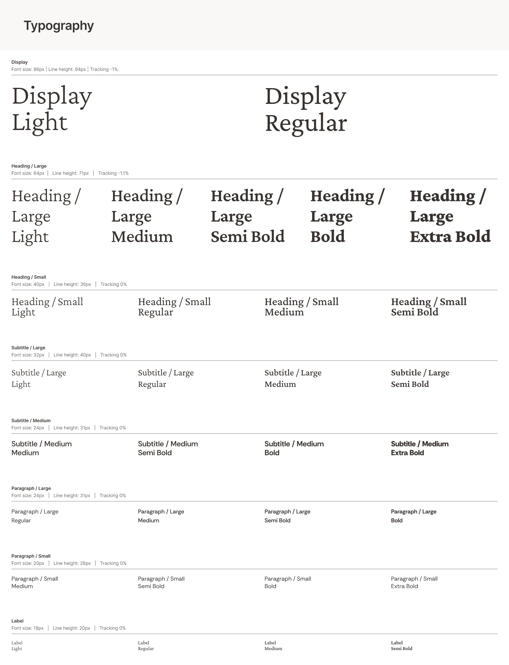
Our typography system is designed for clarity, hierarchy, and scalability across different screen sizes. The Display styles emphasize branding and large-scale visual impact, while Headings, Subtitles, and Paragraphs create a structured reading experience. With variations in weight and size, the type system ensures clear communication while maintaining a modern and professional aesthetic.
Reflection
I learned a lot about client collaboration during this project, as it required me to guide the client through the design process and help them clarify the deliverables. Early on, I found it valuable to break down the project into clear deliverables, aligning what they envisioned with what was achievable within our scope and timeline. This meant balancing their goals with constraints, making sure the expectations were realistic while still bringing their ideas to life. In addition, I worked as part of a cross-functional team, where communication and constant alignment were essential to our success. By keeping the client engaged throughout the project, we were able to deliver a product that reflected both their needs and our team’s expertise.