Brand Design
Apéro Charcuterie Brand Design
ROLE
Brand Designer
Team members
Rayann Liang
Connor Wright
YEAR
2023
Responsibilities
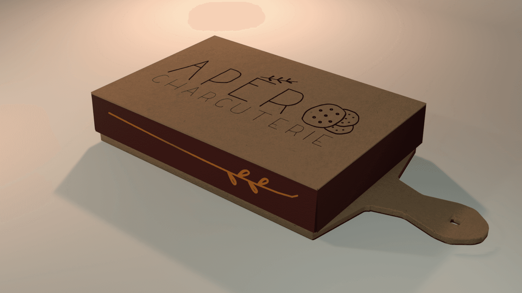
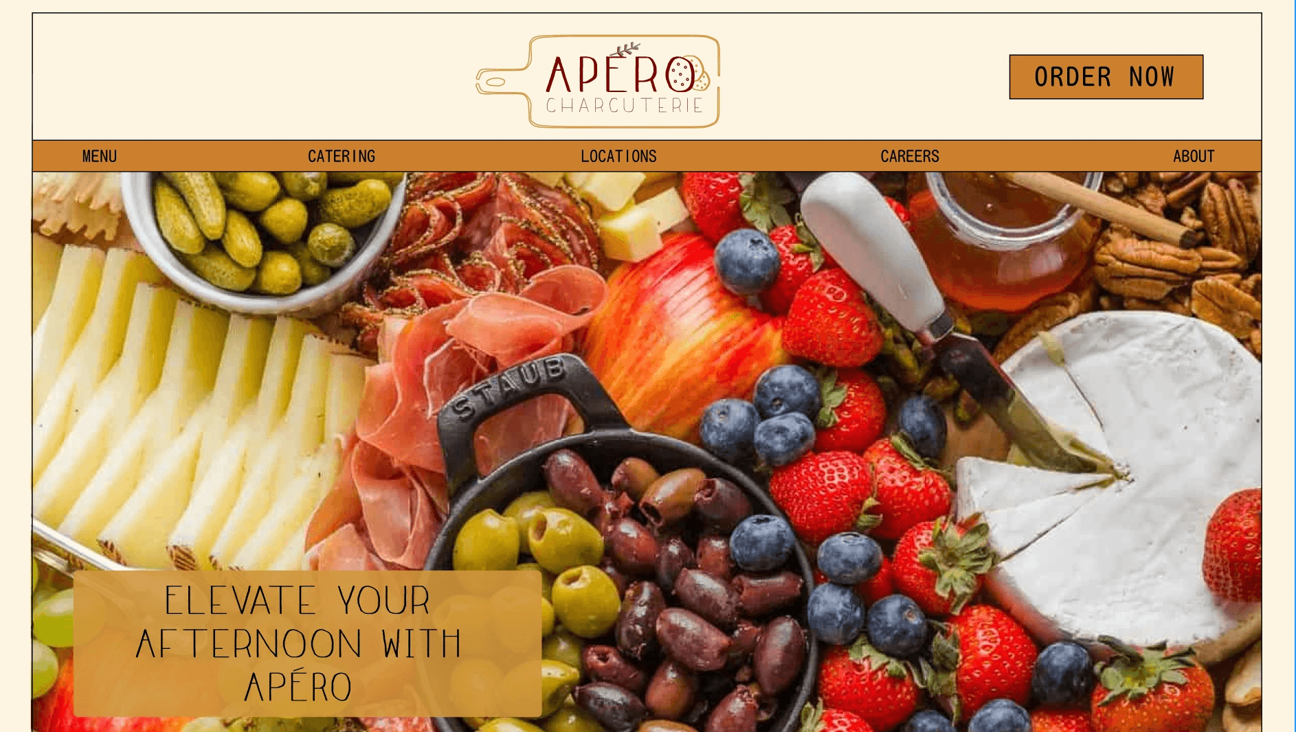
Responsible for creating the mission statement, brand identity prisms, competitive analysis, logos, digital and physical mediums, concept sketching, and wireframes
Background
I enrolled in a visual design class where we had the exciting opportunity to research and design a brand of our choosing. The only requirement was that it needed to be consistent and adaptable across multiple mediums.
My partner and I decided to create a charcuterie board business named Apéro. Apéro is a restaurant that specializes in the concept of customers creating their own charcuterie boards. The name Apéro was inspired by the time of day when people typically enjoy charcuterie boards. We aimed to give the restaurant an upscale yet casual vibe and wanted to reflect that through our brand, including logos, fonts, and color palettes.
Competitive Analysis
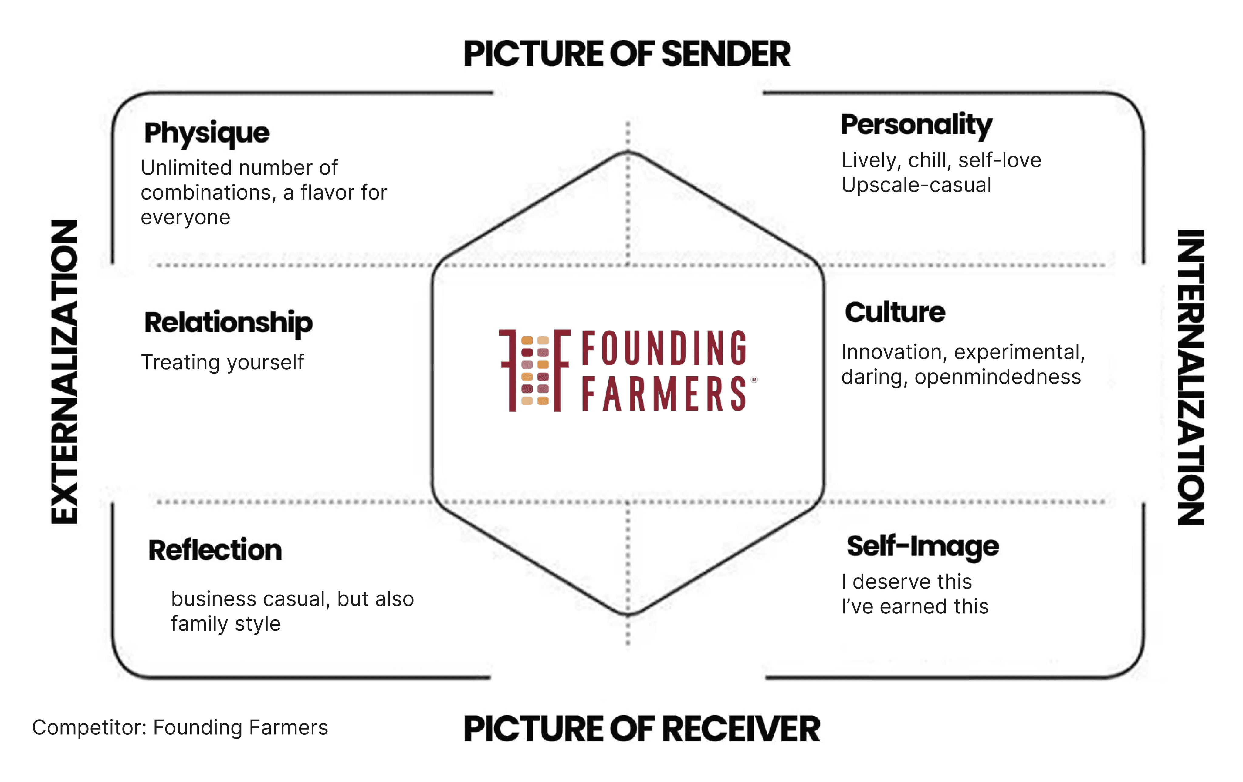
Founding Farmers
Color Palette: They use a dark blue and a deep red which helps give Founding Farmers a warm and comfortable vibe to their online appearance.
Font: Serif fonts for the text of their body paragraphs to suggest the contents of the restaurant as being a high-class/upscale setting. Their logo and headers, however, use sans-serif to make them still seem accessible, modern, and not incredibly formal.
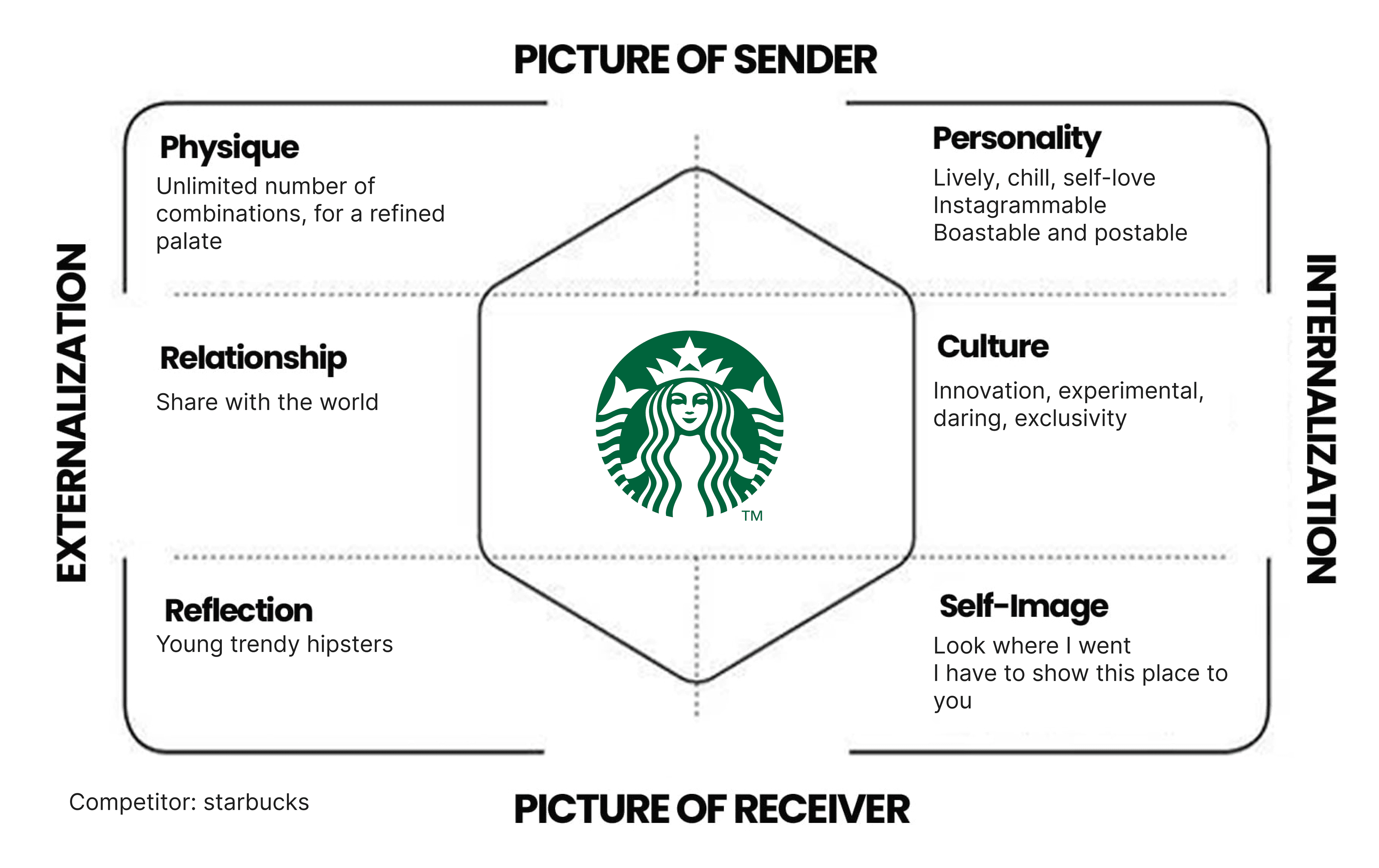
Starbucks
Color Palette: They use an earthy brown and a rich green, representing their company's grounded and comfortable feel.
Font: Serif fonts like Georgia are used to give the text a high-quality and refined appearance. These fonts have a classic and elegant look, which helps convey a sense of sophistication and trustworthiness. The logo and headers use sans-serif fonts which are modern, clean, and easy to read.
Ideation
Apéro
Why the name Apéro?
Apéro is a shortened, informal version of the French word apéritif.
We wanted to pay homage to the origins of charcuterie boards.
It refers to a pre-dinner gathering, typically served with small snacks or finger foods.
Charcuterie consists of finger foods, and we felt this word fully captured our concept.
The apéro is a cherished social tradition in France, and we wanted to embrace the idea of creating a moment for people to relax and enjoy each other's company
One of our values is to make Apéro a place where customers can treat themselves and enjoy the experience.
Mission Statement:
Aperó offers guests the unique opportunity of creating their own personalized charcuterie boards. We aim to ensure that our customers treat themselves because they deserve the good things in life exactly as they want them.
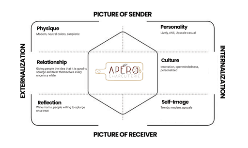
Brandy Identity Prism
Visual Style Guide
Logos

C
Reflection
In this project, we were given a lot of creative freedom to define the brand and determine the direction for our final products. Initially, this posed a challenge as it was difficult to narrow down the possibilities. We overcame this by opting for a more practical approach, selecting specific deliverables we wanted to highlight and then working backward to define the creative direction. This taught us to look at things from a different angle if we were ever stuck on a problem.
One of the most significant takeaways from this project was learning to leverage our strengths and weaknesses as a team. During the project, I noticed that we often had differing opinions at the beginning due to our distinct interpretations of things. Instead of allowing these differences to become sources of conflict, we chose to emphasize and complement each other's strengths.This allowed us to create a project that we could have only created together, achieving the results we desired.

