UX Design/Research
A Reimagined Mobile Budgeting App
organization
Bits of Good
ROLE
UX/UI Designer
Team Members
Rayann Liang Hannah Tsai
YEAR
2023


The goal was to create a a mobile app that would combine the convenience of mobile budgeting with the benefits of desktop budgeting.
Responsibilities
Responsible for research, semi-structured interviews, competitive analysis, concept sketching, wireframing, hi-fi prototyping, and user testing
Background
We discovered that there was a gap between desktop budgeting and mobile budgeting. Although there were many mobile budgeting apps on the market, a vast amount of people preferred desktop budgeting (e.g. Excel & Google Sheets) compared to mobile budgeting. We set out to figure out why and create a mobile app that would combine the convenience of mobile budgeting with the benefits of desktop budgeting.
1) Preference for desktop budgeting
Many users rely on desktop tools like Excel or Google Sheets because they are familiar, flexible, and provide detailed budgeting capabilities.
2) Limited customization in mobile apps
Mobile budgeting apps are less customizable, as each app focuses on specific features, preventing users from tailoring the app to their unique budgeting needs.
Solution
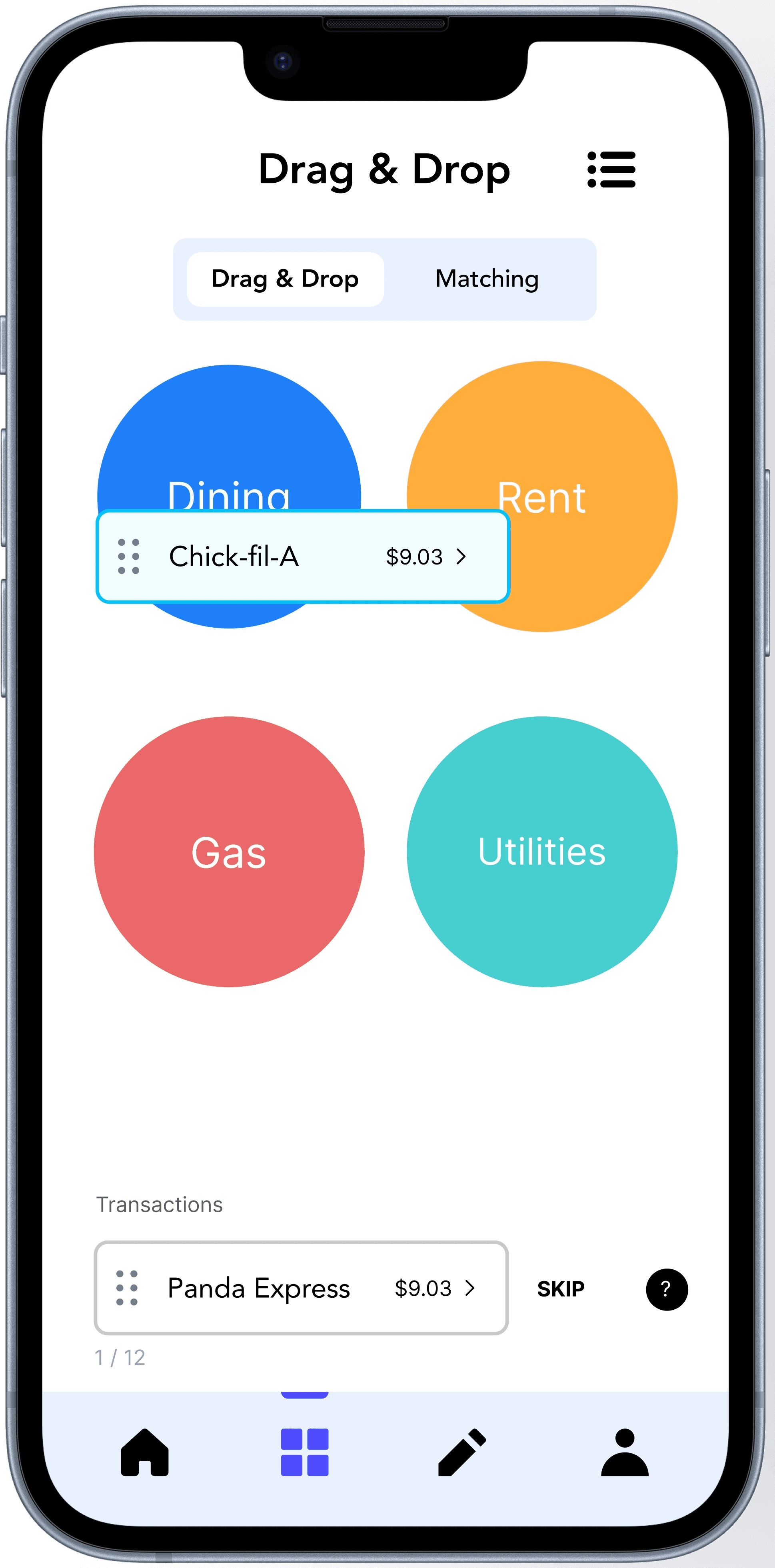
Drag & drop for transactions
Our application’s primary function is an intuitive drag-and-drop system. The system gives users the satisfaction of placing transactions into the appropriate categories.
We have also incorporated a matching feature to cater to users with accessibility needs. This feature allows users to tap instead of drag.


Research
Research Goals
Understanding user’s goals when the are budgeting
Learning features users hope to see
Identify user tendencies in certain platforms
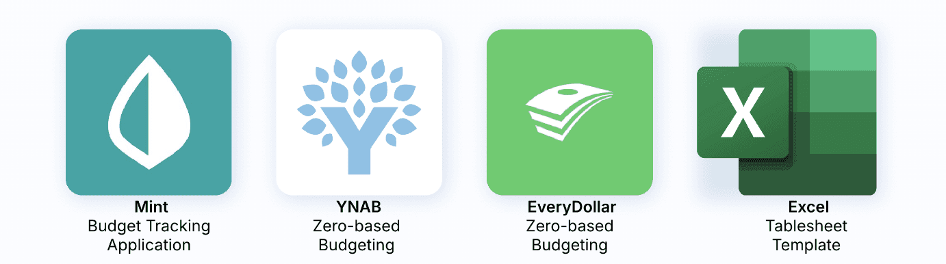
Competitive Analysis
We looked at the current digital budgeting options on the market, including mobile apps and spreadsheet software.
Mint is the most user-friendly option for people new to budgeting but lacks simple features that users are looking for, such as the ability to sync financial accounts and view everything in one place.
YNAB uses a “zero-based budgeting” method, which is different from most other budgeting tools. This approach comes with a steeper learning curve, but many users report success once they get the hang of it.
EveryDollar also uses “zero-based budgeting” and has a limited free version that requires users to manually input all their expenses. People like its intuitive interface, but many of the features are locked behind a paywall.
Excel (Google Sheets) remains the most popular tool for budgeting due to its high level of customization. However, it is less convenient since it is spreadsheet software and requires more manual input.

Semi-structured interviews
5 semi-structured interviews
Interview: We conducted interview sessions with five participants, each exhibiting varying degrees of engagement in budgeting
P1: Freshman at GT, pays for tuition, uses Mint once a month
"Every time I open my app I look at the given graph. It makes me feel more satisfied after I see my budget progress"
P2: Recent college graduate, makes income, uses Excel once a month
P3: Junior at GT, makes income for wants, uses journaling each month
"I usually journal and use an app to budget. But I like to journal because it puts me in a more productive mindset to budget."
P4: Senior at GT, just started getting income, uses Google Sheets each month
P5: Freshman at GT, making income, uses Excel twice a month
" I will go to my Excel sheet and update it every other week. It's simple and gives me full control."
Key Findings
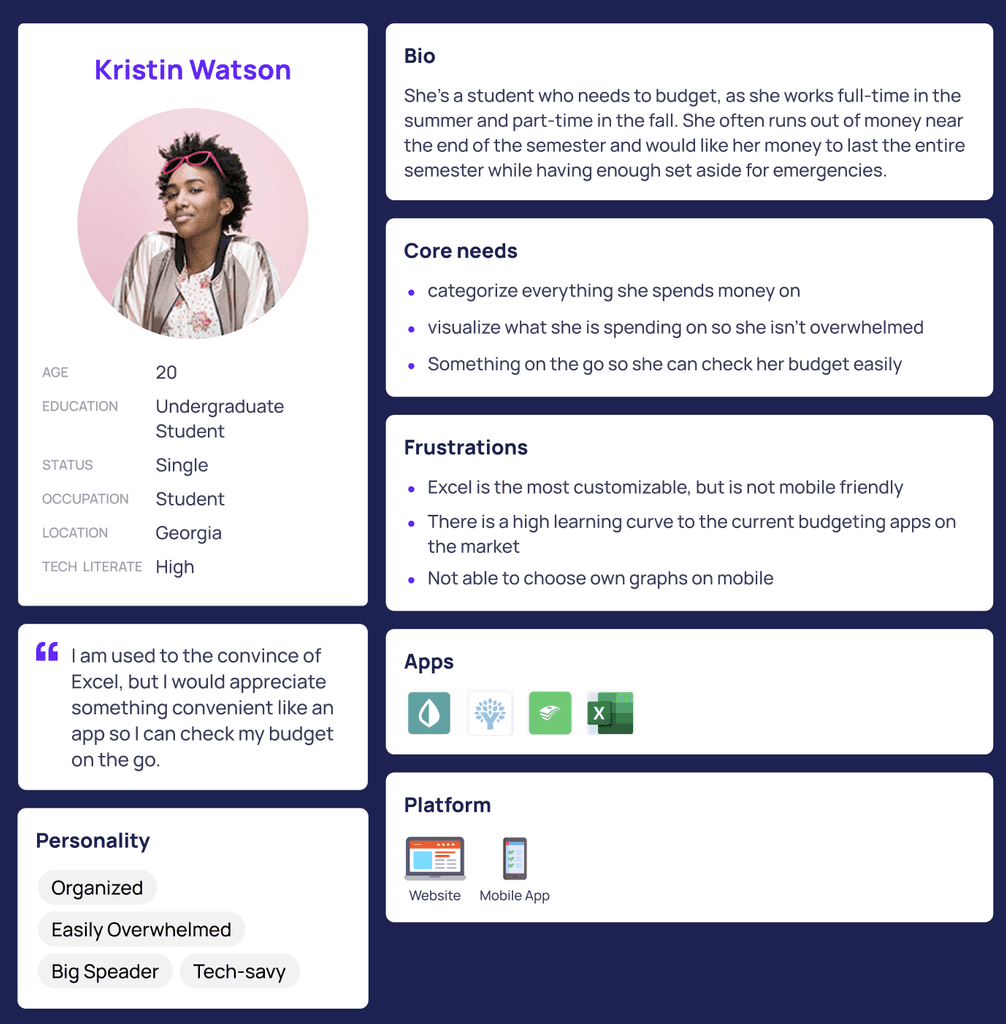
User Persona
I then created a user persona with the user needs and pain points.
Ideation
User Flows
We designed three key user flows: logging in, onboarding, and building a personalized budget plan.
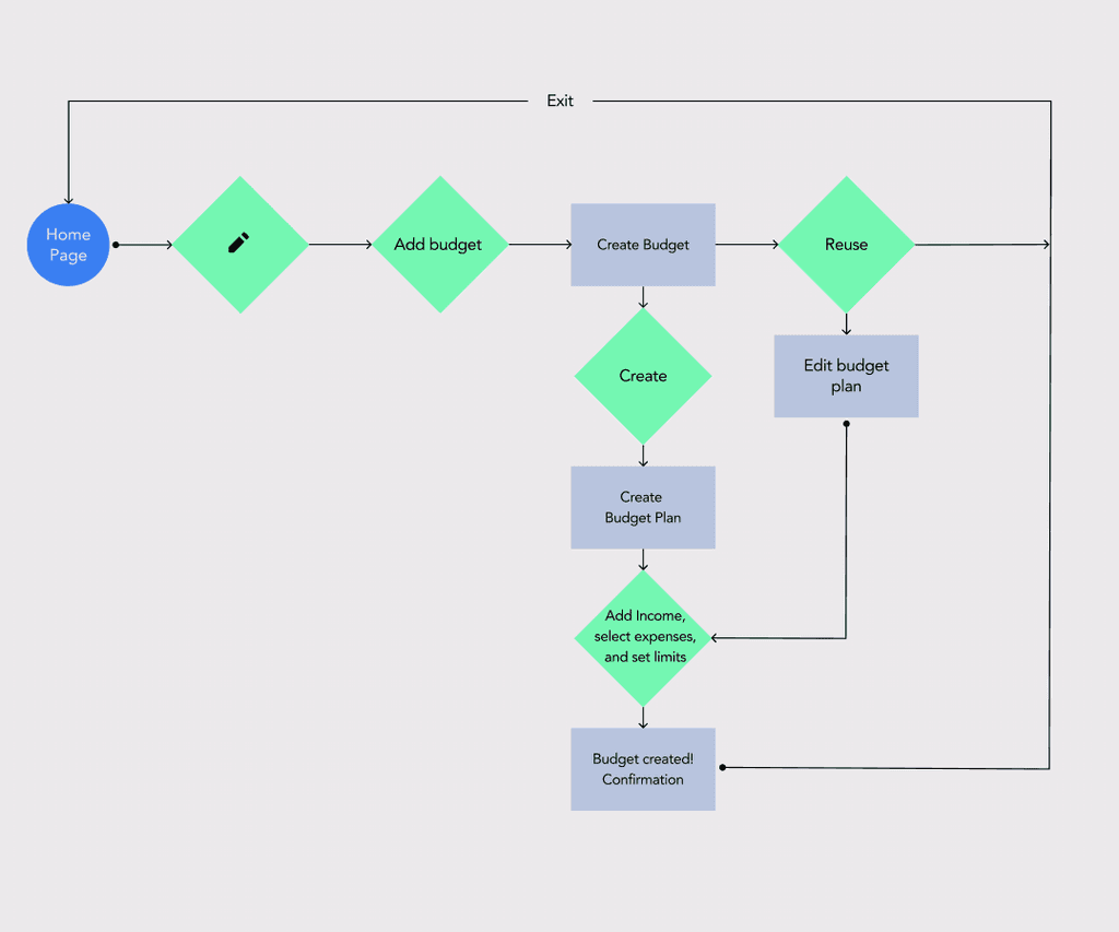
Creating a Budget Plan User Flow

Onboarding User Flow
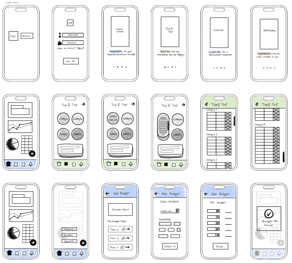
Lo-fi
I created lo-fidelity wireframes to map out the structure and user flows. These sketches allowed me to focus on layout, hierarchy, and functionality without getting distracted by visual details like color or typography.
By iterating rapidly at this stage, I was able to test multiple approaches, gather feedback, and make informed decisions about navigation and content placement.
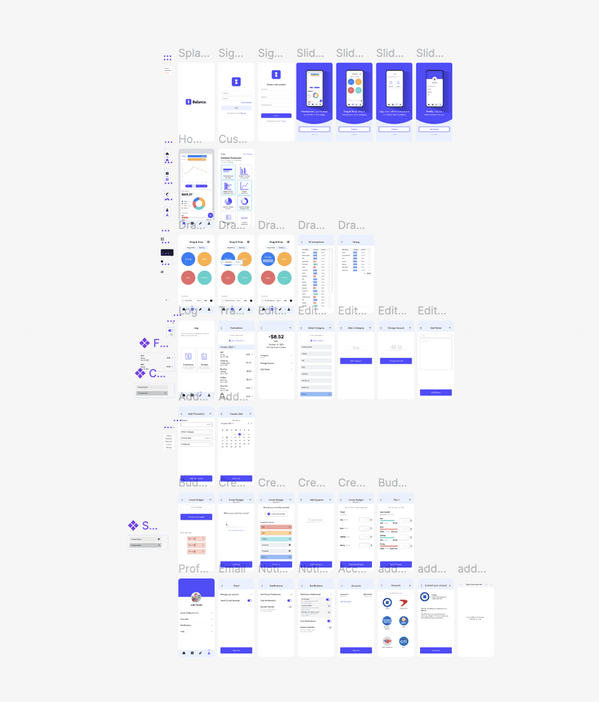
Hi-fi
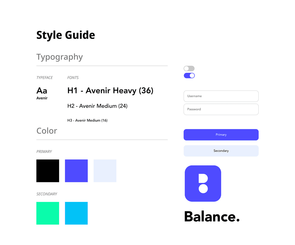
Design System
Reflection
I learned a lot about time management during this project, as it was the first time my partner and I collaborated on such an extensive UI/UX project. Given the vastness of the budgeting topic, we aimed to cover every aspect we discovered. However, we quickly realized that 10 weeks were insufficient to fully develop all our ideas. So we made the decision to prioritize the most important elements of our application for further development, ensuring that our work reflects the core aspects of our vision. Through this experience, we were able to work efficiently under time constraints, allowing us to showcase the best possible version of our application during our timeframe.